Process
Why we show design routes in context, not on boards
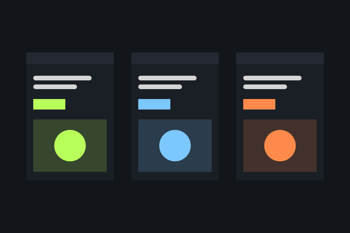
Mood boards ask clients to imagine. Routes shown on their real website, shopfront or app let them judge. What changed when we stopped presenting on blank pages.
Read the articleWhat we are learning about identity, typography, accessibility and running a small studio. A new piece most months.
Process
Mood boards ask clients to imagine. Routes shown on their real website, shopfront or app let them judge. What changed when we stopped presenting on blank pages.
Read the articleSample listing. Only the featured article has a page: duplicate journal-article.html for each post you publish and link its card.
Typography
Two typefaces, chosen for the hundredth use rather than the first. A checklist we've refined over twelve years.
Colour
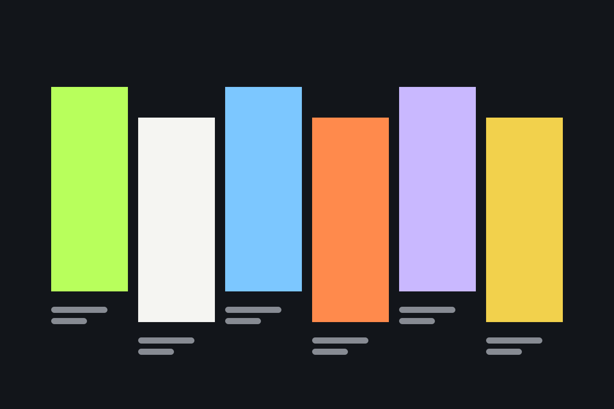
Why we now design every palette in pairs, and the three contrast checks we run before anything ships.
Accessibility
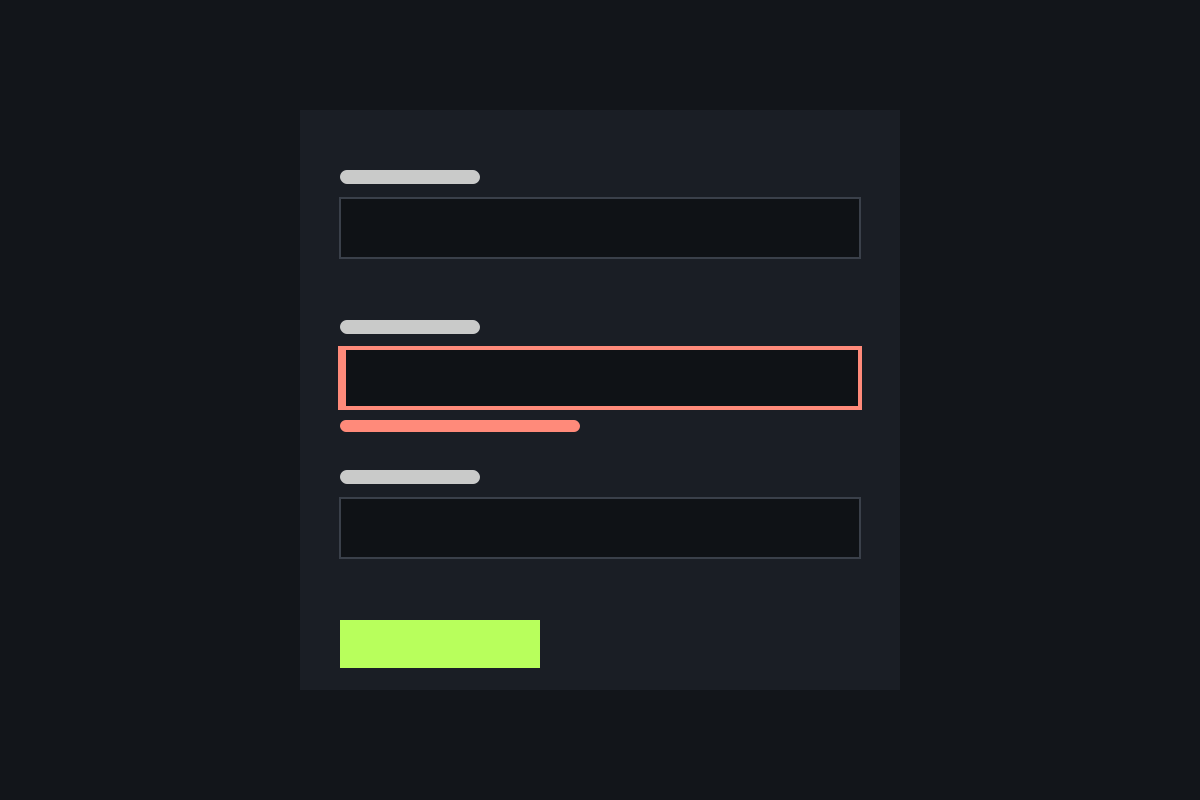
Most form errors are written for developers. Here's how we rewrite them for the person filling the form in.
Process
Grids should make decisions easier, not make every page look the same. Notes from our layout reviews.
Studio
Three summers of shorter weeks: what happened to deadlines, clients and the work itself.