For years we presented identities the way most studios do: a logo on a white page, a few colour chips, a typeface set in a neat specimen, and a mood board of photographs we liked. Clients nodded, asked for "a bit more energy" and picked the one that felt safest.
The problem wasn't the work. It was the question we were asking. A logo on a white page asks do you like this? That's a question about taste, and taste is the hardest thing to agree on in a room of six people.
Boards ask the wrong question
What clients actually need to decide is whether a direction will work for them: on their menu, their booking page, the side of their van. When we show a route on a blank board, we make them do that imagining on their own, in their heads, all at different speeds.
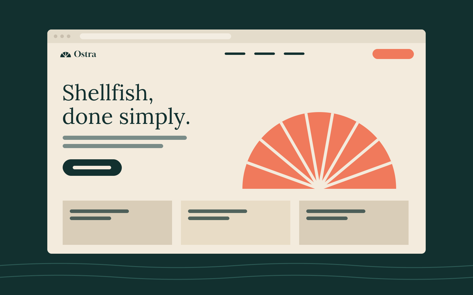
The moment a route sits on the client's own home page, the conversation stops being about taste and starts being about fit.
So we changed the brief to ourselves. Every route we present now has to be shown in at least three real places from the client's world, using their real words and, where we can get them, their real photographs.
What "in context" means for us
- Their words, not placeholder text. We use the current website copy, even if it's going to change. It's familiar, so they notice the design rather than the text.
- Their hardest page, not their easiest. A pricing table or an allergen list tests a typeface far better than a three-word slogan.
- Small sizes first. The favicon, the app icon and the receipt header come before the billboard.
Three routes, not one
We always show two or three routes, and they are genuinely different: not three shades of the same idea. One usually takes the brief literally, one pushes it, and one questions it. Clients rarely pick the one that questions the brief, but it almost always changes the one they do pick.
Showing more than three is a mistake we've made too. Past three, people start comparing details instead of directions.
What it costs
Working this way takes about 20% longer in the direction phase. We now build that time into every plan, and it pays for itself later: fewer revision rounds, shorter feedback emails, and far fewer "can we see it in green?" requests three weeks before launch.
If you're a client, ask your studio to show you their routes somewhere you'll recognise. If they can't, that tells you something too.
Sample article written for the template. Replace it with your own writing.