Case study · Hospitality
Ostra Seafood Hall
A market restaurant that cooked like a destination but looked like a canteen. We gave it an identity, printed menus and a website built around one action: booking a table.
The brief
Ostra had a loyal lunch crowd and almost no one at dinner. Its sign, menus and website had been made by three different people over six years.
The owners wanted evening guests to see what regulars already knew: the fish arrives that morning, the menu changes daily, and the room is lovely after dark. They had a budget for one launch, so everything had to be ready on the same day.
Our job: an identity that works on a chalkboard as well as a phone, menus staff could update in minutes, and a website where booking a table takes two taps.
The idea: a shell that opens like a fan
The symbol is a scallop drawn as a half-circle with eight ribs, so it reads at the size of a stamp and still looks generous on the front of the building. Its colours come from the market itself: wet stone, fish-scale green and the coral of a cooked langoustine.
Palette
- Deep sea #12302F
- Coral #F07A5C
- Sand #F3EBDD
- Shell #D9CDB8
- Kelp #2C5A55
Typography
Display: a classic serif for the name, headlines and dish names. Warm, a little old-fashioned, like a fishmonger's sign.
Text: a plain grotesque for prices, allergens and the booking flow, where clarity matters more than character.
From menu card to front door
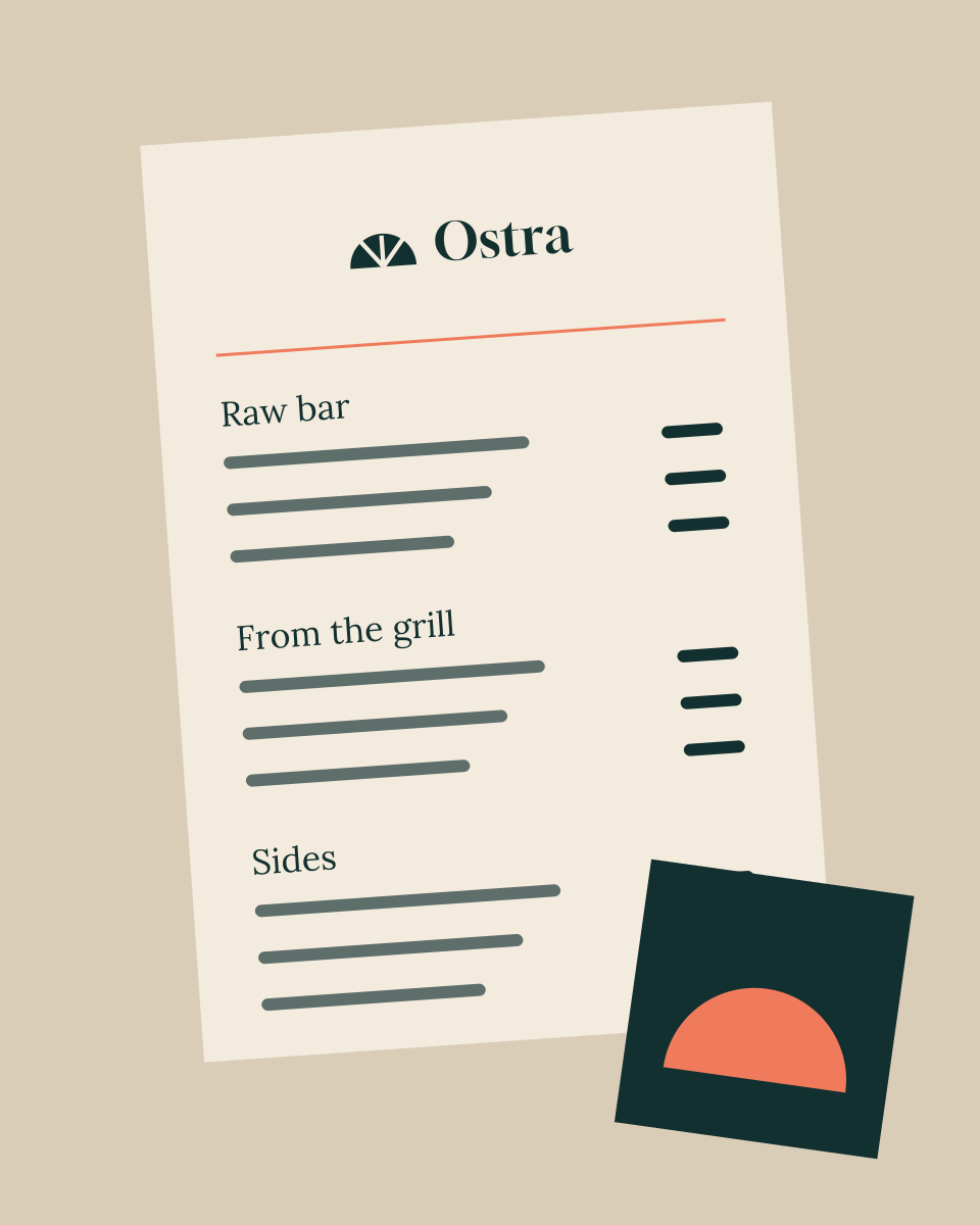
The menu is one sheet, reprinted every morning from a template the kitchen fills in. The coasters double as table numbers.
A website that seats people
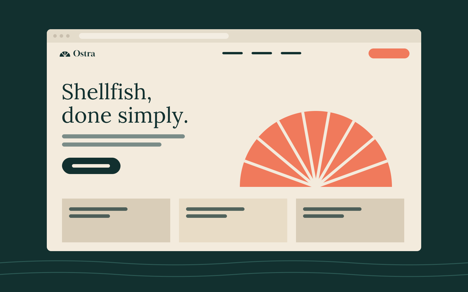
Most visitors arrive on a phone, a few minutes from the door. So the home page opens on today's menu and a single button. Everything else (the story, private dining, gift cards) sits one level down.
- Booking in two taps, connected to the restaurant's existing reservation system
- Today's menu published by staff from a phone, no designer needed
- Allergen information on every dish, readable by screen readers
- Loads in under a second on a 4G connection
What changed
- +38% evening bookings in the first three months
- 2 taps from the home page to a confirmed table
- 1 day to train front-of-house staff on the menu tool
Sample figures for a fictional client. Publish only results your client has agreed to share.
They asked better questions about our business than our own board did. The new menus are the first ones our chefs actually like printing.
Want results like these?
Tell us where you are and where you'd like to be. We reply to every enquiry within two working days.